The PH 5 and two epic road trips

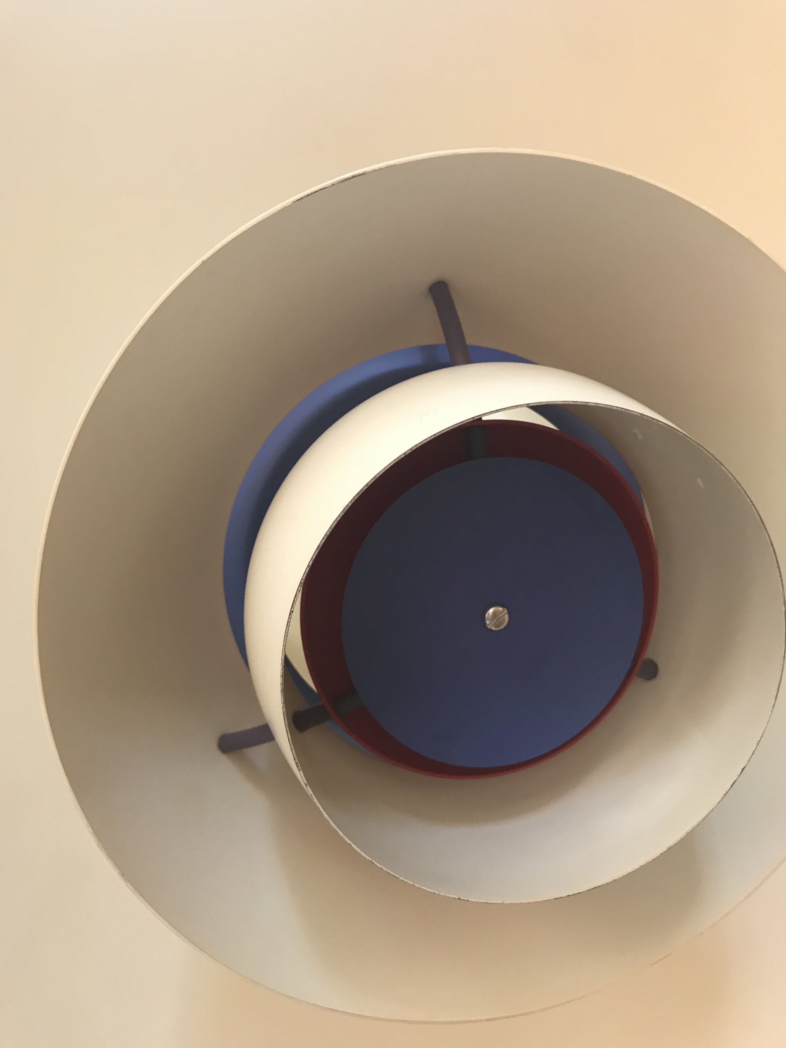
First thing this morning, the electricians came to hang my PH 5. My excitement was palpable, and I regaled them with the story of how we acquired the lamp and tenderly carried it home in our hand baggage, thanking kind flight attendants along the way who smiled at the misshapen, slightly oversized parcel, and kindly tucked into their coat closet and my overhead bin.

So you can imagine my mouth-agape-slo-mo-horror as one of the electricians (two of the nicest guys) bumped the just-hung lamp from the plate that attaches it to the cord, and we all watched it FALL TO THE GROUND with a crash. 

"Please tell me that it's not dented," I gasped. 

"I am so sorry," one of the guys said as he handed me my very dented lamp. Y'all, time stopped. I took a deep breath, told him I understand how sorry he was but could he please give.me.a.minute, and gingerly assessed the damage. Fortunately, I was able to mostly reshape the shade, but the entire fixture was slightly off-center and no one could get it back on the mounting plate. 

I did feel so terribly for how terribly I knew these guys felt, y'all. I had literally JUST told them that this was a thirty-year-old treasure that I had carried home from Denmark. And then bam. But still. And there is a gash in our newly-refinished floors.

I took another deep breath, bid them adieu, met with a darling client, picked my mom up from the airport, called Tom, and decided not to think about things until he, my dear and infinitely capable husband, got home.

Readers, he fixed it. Mostly. It is such a gem, and I just love it. And now Mom and I are sitting here, me writing, she puzzling, under the perfect, non-glare, non-shade glow of Henningsen's genius.

IMG_2165.jpg
IMG_2171.jpg
IMG_2169.jpg

Tomorrow, she and I embark on a road trip to Maine. We are going to get the boys!!!!!!!!!!!!!!!!!!!!!

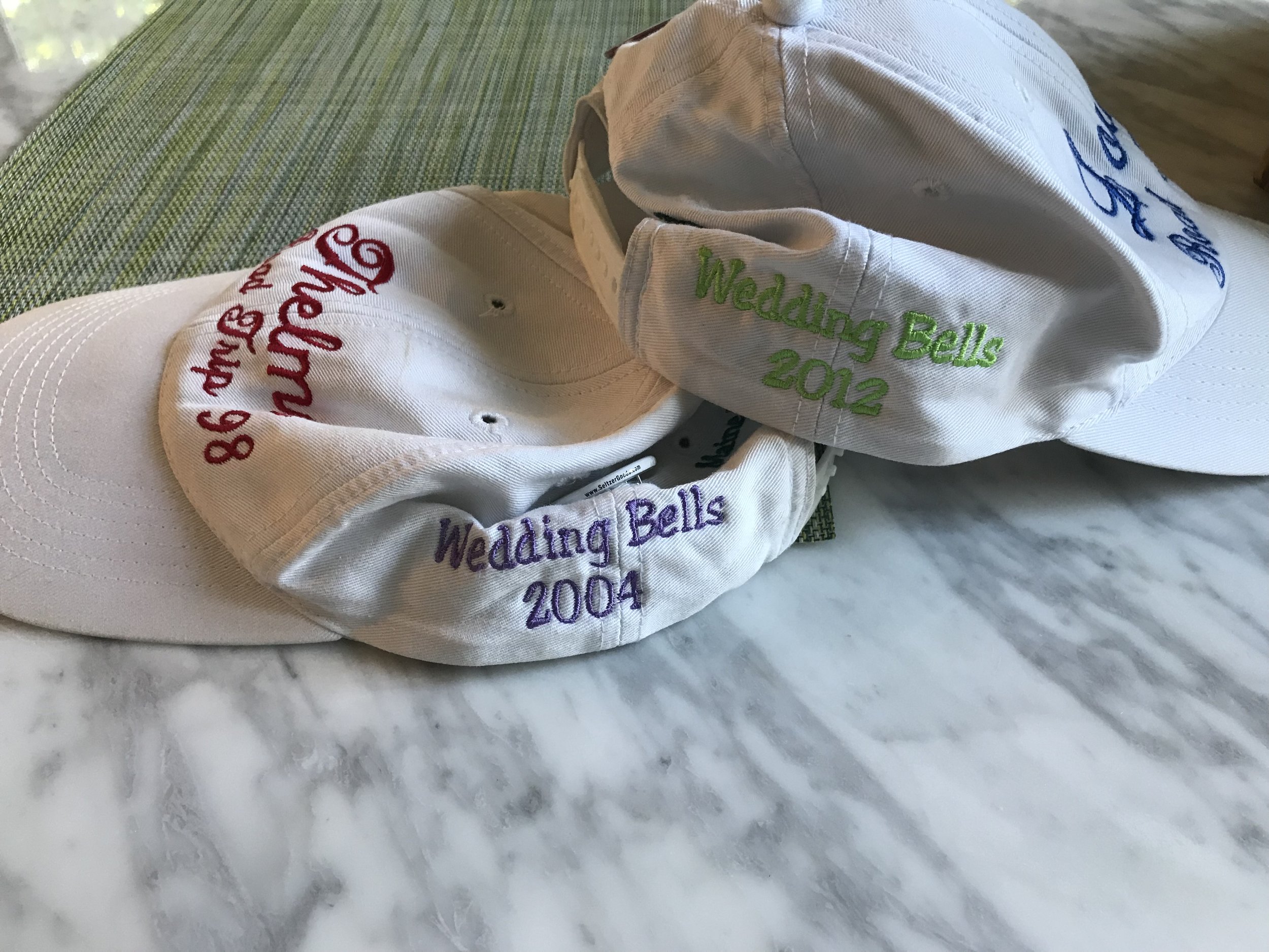
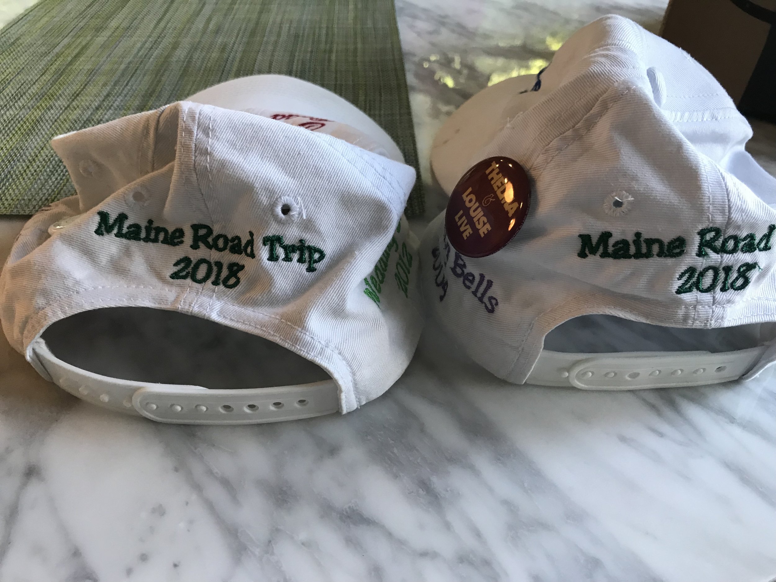
While this road trip will be fun and special for many reasons, it also marks the 20th anniversary -to the month- of the road trip we made from Lake Charles (Louisiana) to Philadelphia to move me to graduate school. For that occasion, she had caps monogrammed for us: Thelma and Louise, Road Trip '98. She was Thelma, I was Louise, and we were going to make that endless Uhaul-towing-a-car drive fun.

IMG_2161.jpg

A windshield crack started on the passenger side early on. That side mirror shook SO violently that we wondered if it up and broke the windshield. In any case, that crack travelled all the way across the windshield as we drove east and north. Somewhere in Mississippi, we pulled into a truck stop for gas, and there Mom bought a truckers manual. We filled in various bits of information about our "rig" all the way to Philly and managed not to have to back up once. We couldn't, so doing so really wasn't an option.

We actually did have the best time, and since then, the hats have marked important times in our lives: my wedding, my sister's wedding, and now this trip to Maine. I sent mine home a few months ago so Mom could get the monogramming done at the same place she always has. Sadly there are new owners, and they seem to have zero humor or joy, but alas. The hats look great.

We are renting a minivan in the morning, packing up, and heading out. We'll stop in Philly, for the obvious reason but also to see one of Mom's friends, and on and up and into Maine by Saturday for the camp parent social. After pick up on Sunday, we'll make our way back down, arriving home on Wednesday, all together once more. 

Our gold medal find at Port 33 Vintage

As I mentioned, one of the reasons Tom and I included Denmark on this trip was to explore more deeply my mad love of Danish design. It is so clean and well designed and well made and beautifully proportioned. It is functional but it lasts.

Mogensen (who I mentioned yesterday re: the film we saw at the Design Museum) studied under Kaare Klint, a father of Danish design who emphasized top quality and perfect craftsmanship. He also felt strongly that anything superfluous to function should be stripped away. So upholstery? Out. Mogensen then worked for FDB Møbler under Frederick Nielson. FDB's mission was to provide functional, comfortable furniture to the general population. 

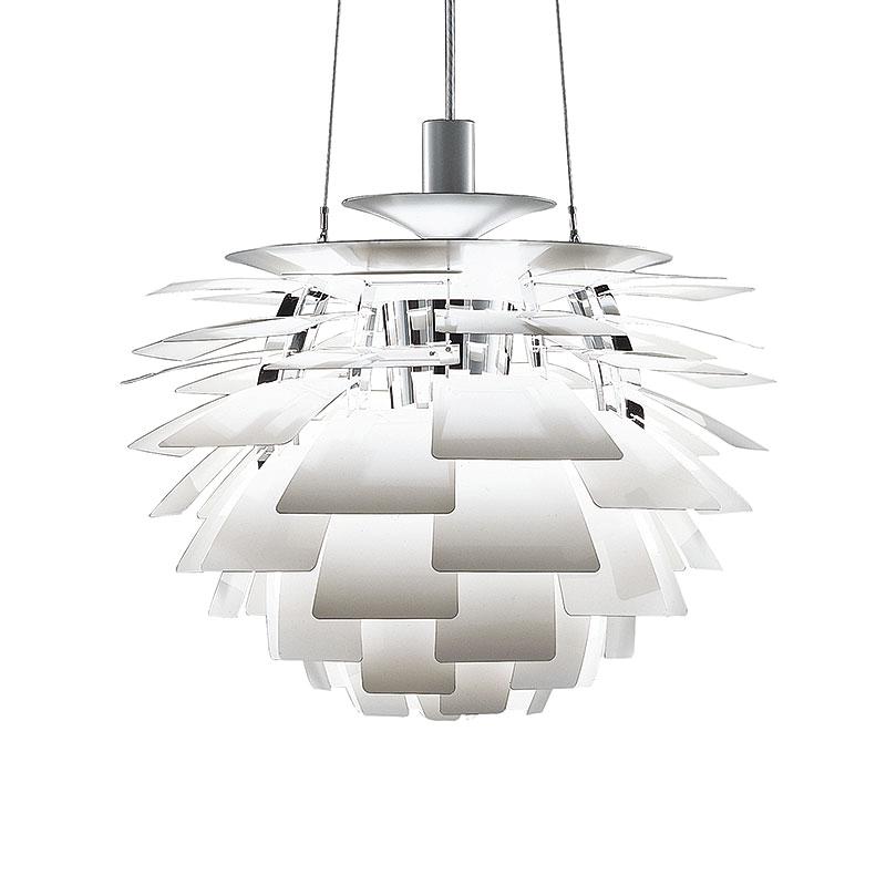
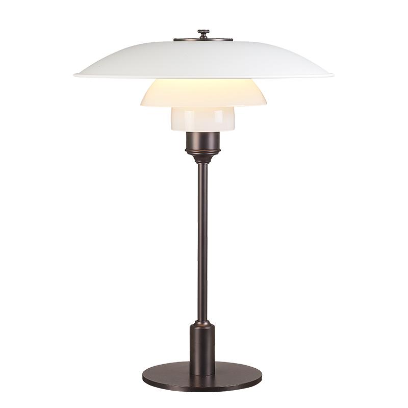
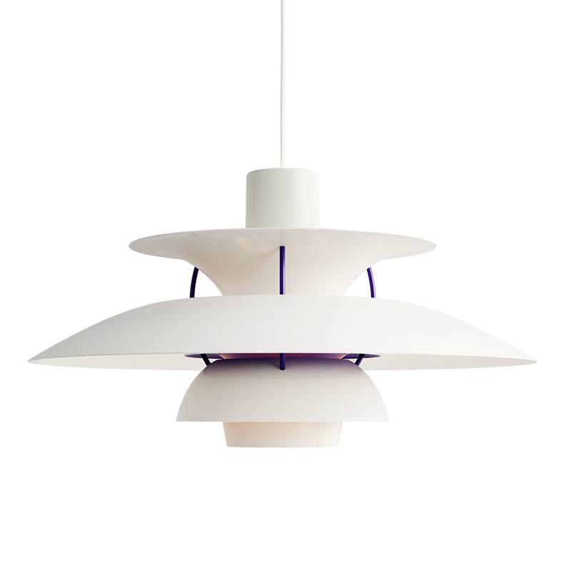
Anyway, during this creative heyday, the preeminent lighting designer in Denmark was Poul Henningsen. For 42 years he designed all manner of lamp for Louis Poulsen, a renowned lighting manufacturer. Henningsen's various models are so common globally that you've probably seen them, or copies inspired by them, without even realizing it. Here are some examples...

^   PH Artichoke; PH 3½; PH 5   ^

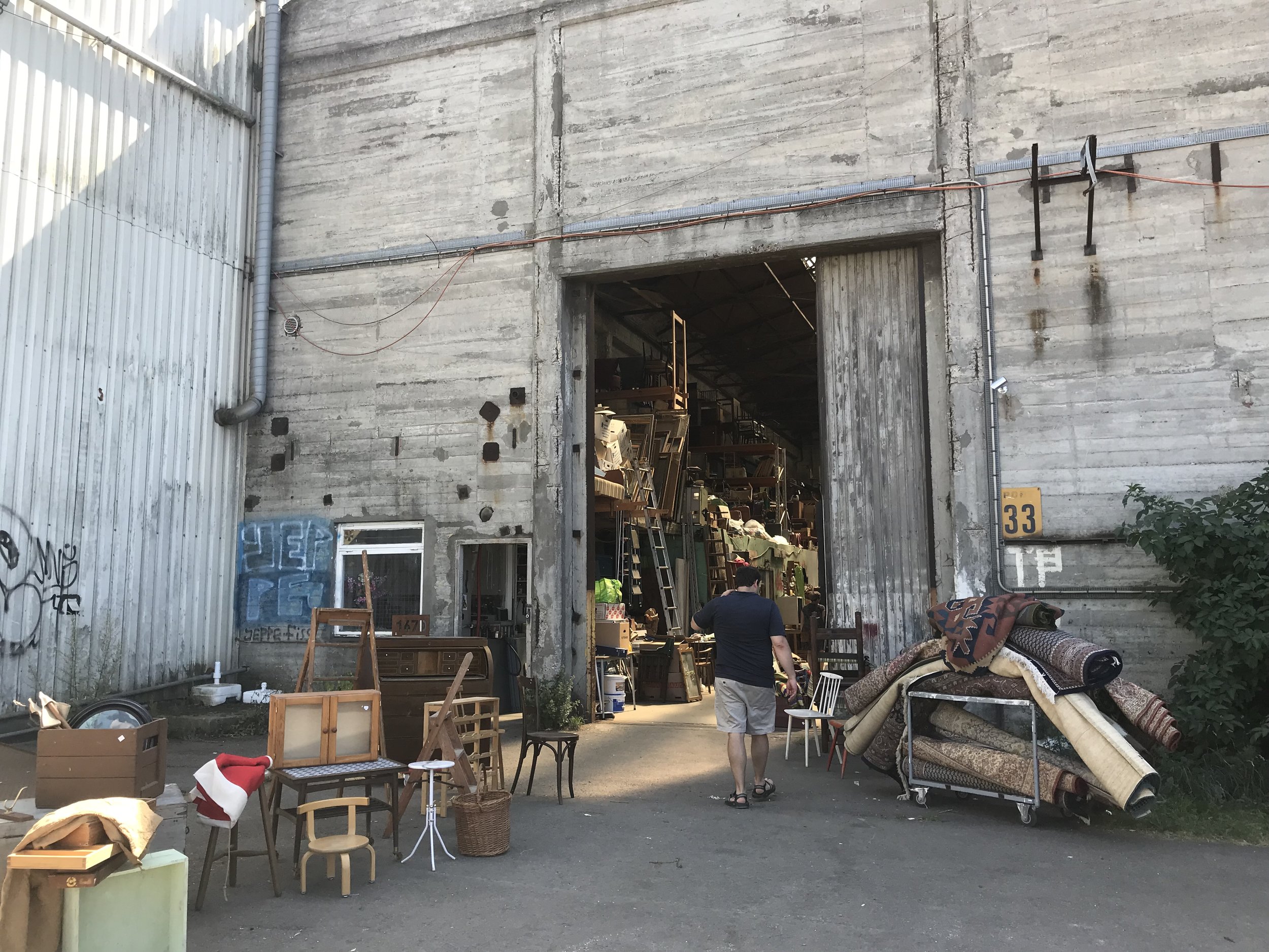
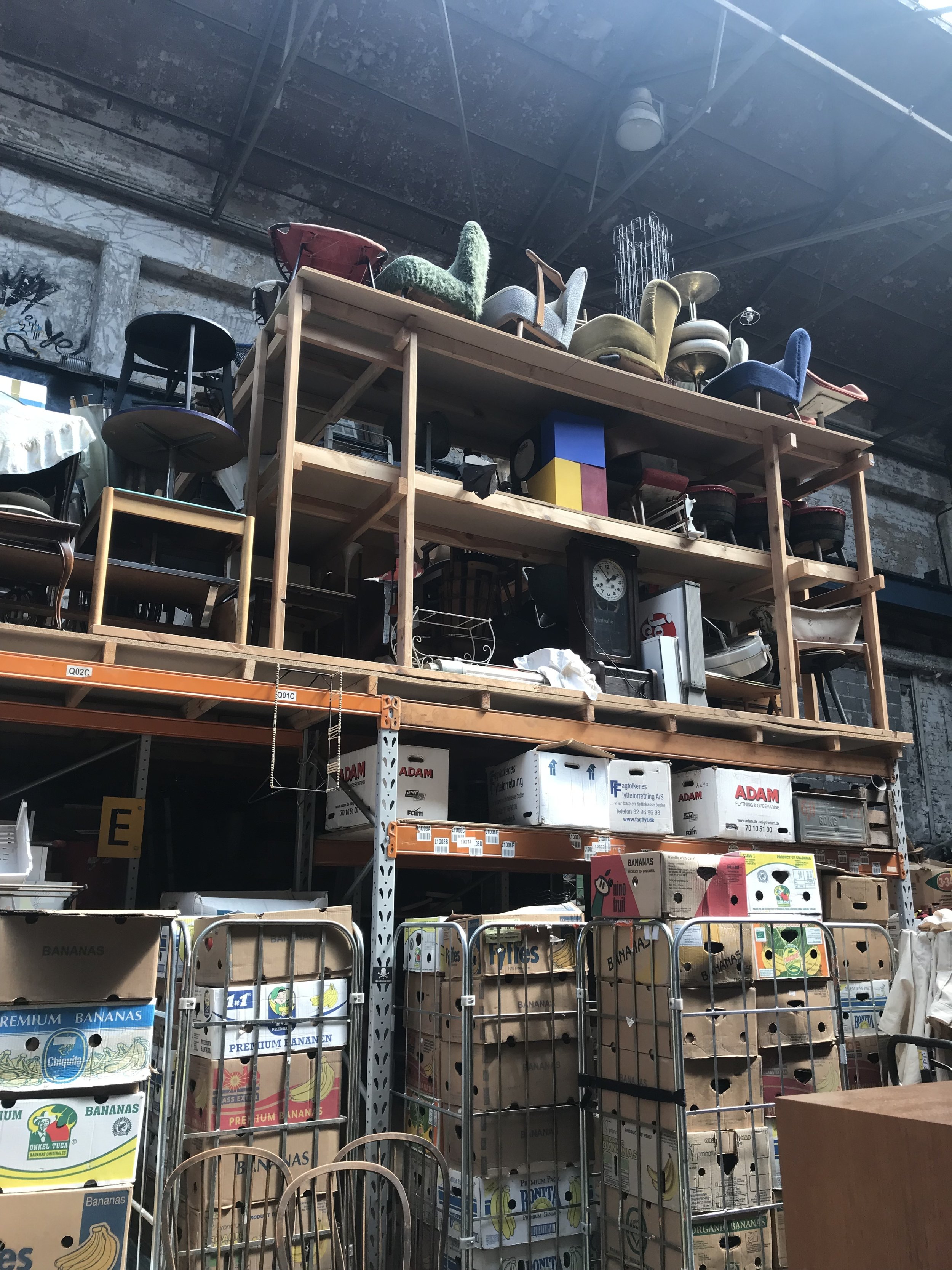
Yesterday, on a break from eating pulled pork sandwiches and tacos, we walked to Port 33 Vintage, a market just outside of Reffen's back entrance. It is a huge warehouse full of dust and treasures and junk, the sort of place you have to spend time searching through but in which might be some gold medal discoveries.

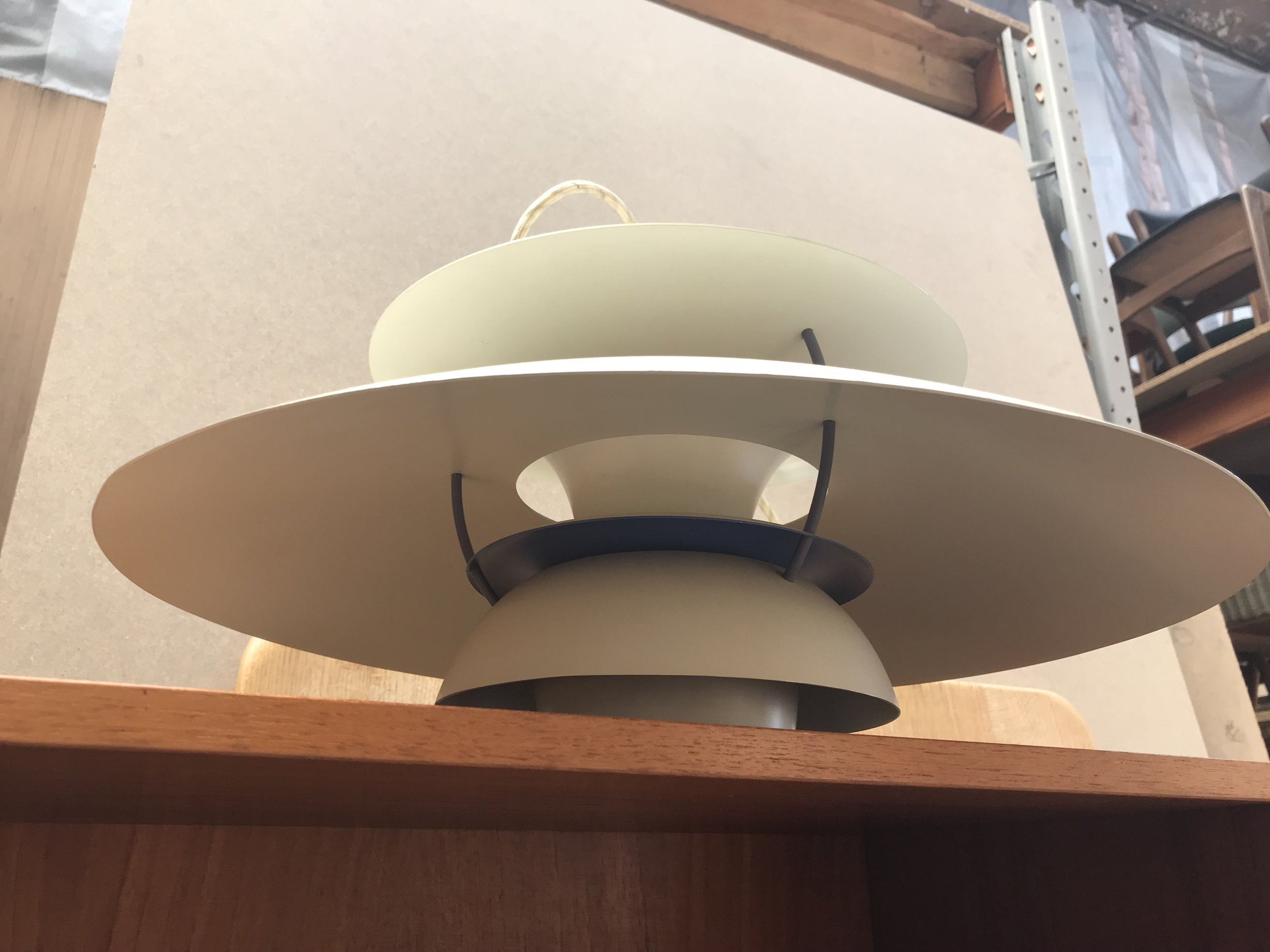
As I meandered through vases and port glasses and broken kids' toys and seemingly infinite mid-century chairs, I spied what looked like a PH 5. Dirty, yes, but the metal screens were unbent, the spacers were all in alignment, and the colored parts were the most delightful red and blue, one of my faves. I checked the neck, and there was the label: Louis Poulsen. Model and other original markers were there too. 

I started to get the total-body feeling of thrill. Here I was. In Copenhagen, the birthplace of Poul Henningsen, to see Danish design in the flesh. And a real piece, not a remake could maybe be mine. I texted my darling cousin who is a designer. 

"Doll- it's em and I'm at a vintage market in Copenhagen where I have found this original Poulsen pendant. What do you think?"

His response was to "Snatch that up and never let go!!!!!!!!!!!!!!!!"

I negotiated to 1050 Danish kroner which, even knowing that the cord needed replacing and not knowing exactly what I'd find under the accumulated dirt, I knew was a fabulous deal. 

After the renting of the bikes and going to and from Christianshavn to find an ATM and knocking on the closed market door with a beer once finally back but after watching England score the first goal, the dealer told me how to take the lamp apart should I need/want to and packed it in a filthy, ancient box. I promised I would carry it home as a personal item. He was such a dear.

IMG_1592.jpg

On the metro home, a random Dane peered into the box and said, "Oh! A vintage PH lamp. Did you just find it?"

"Yes," I said. "I just got it at a vintage place." He asked how much, I told him, and he was all "You got a GREAT deal. Especially since it's the red one. That's the best. Usually those go for around 2000 or more kroner. You are lucky. Great find."

I felt smugly wonderful in front of Tom who thus far had largely supported this mad endeavor simply because he loves me. Which is absolutely enough, but I suspect there may have been an interior eye roll in Port 33. There are NO more eye rolls now. Darling man immediately started researching authentic replacement cords (he found a great site and ordered everything today after we saw the current PH 5 models [version 6 now] in a store today). Cooler than cool is that we are nearly certain that ours is a version 3 manufactured here in Denmark in 1988 AND this year, 2018, is the 60th anniversary of the PH 5 lamp itself!!

I am just in heaven. What a special find on a special trip! We carefully took the lamp apart, cleaned it all (unbelievable what great condition it is in), and packed it in the materials we'd brought (I always travel with both bubble and foam wrap, tissue paper, and packaging tape) plus the repurposed box from the market. I can't wait to see this beauty hanging above my reading chair in our room.

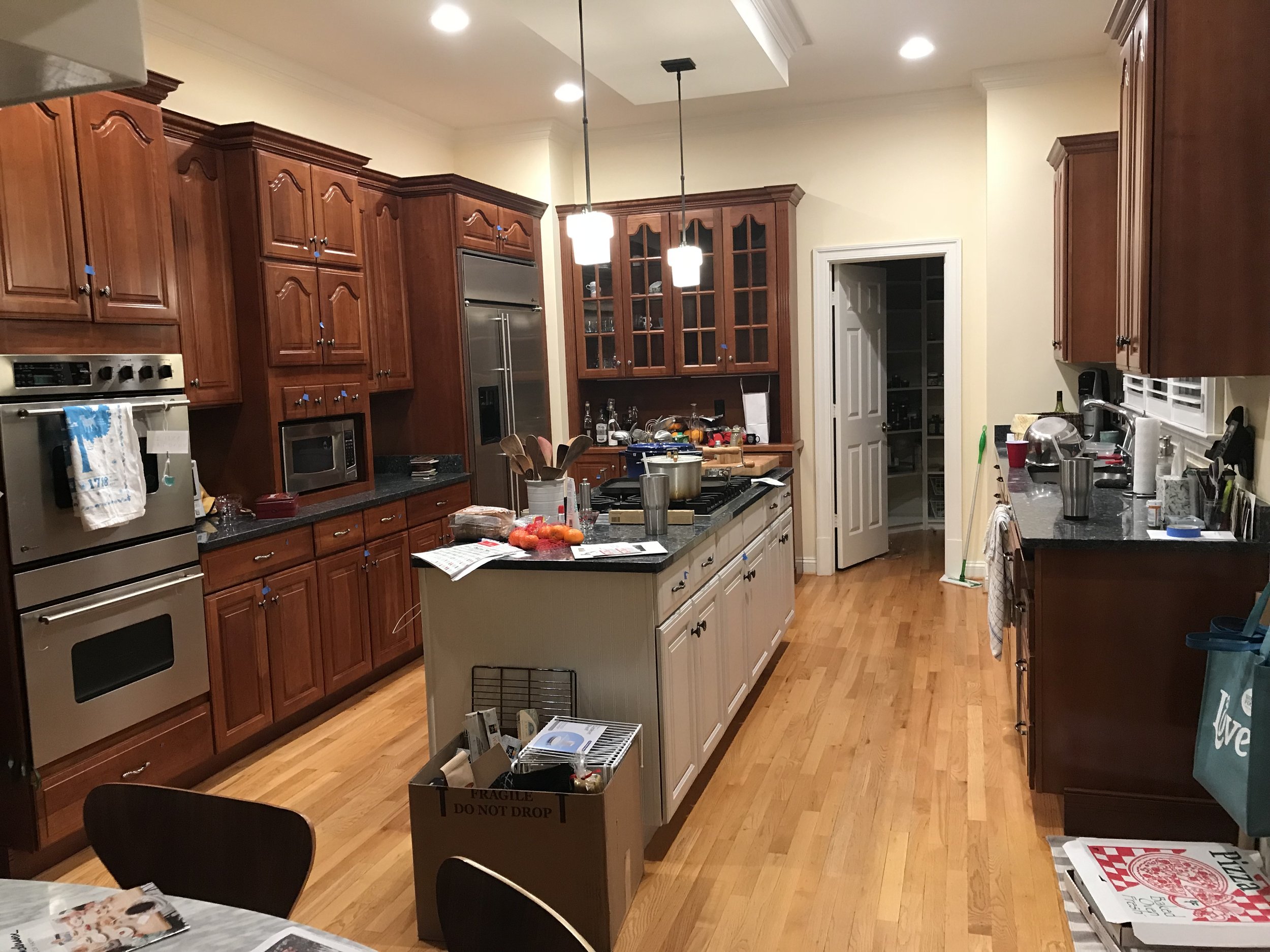
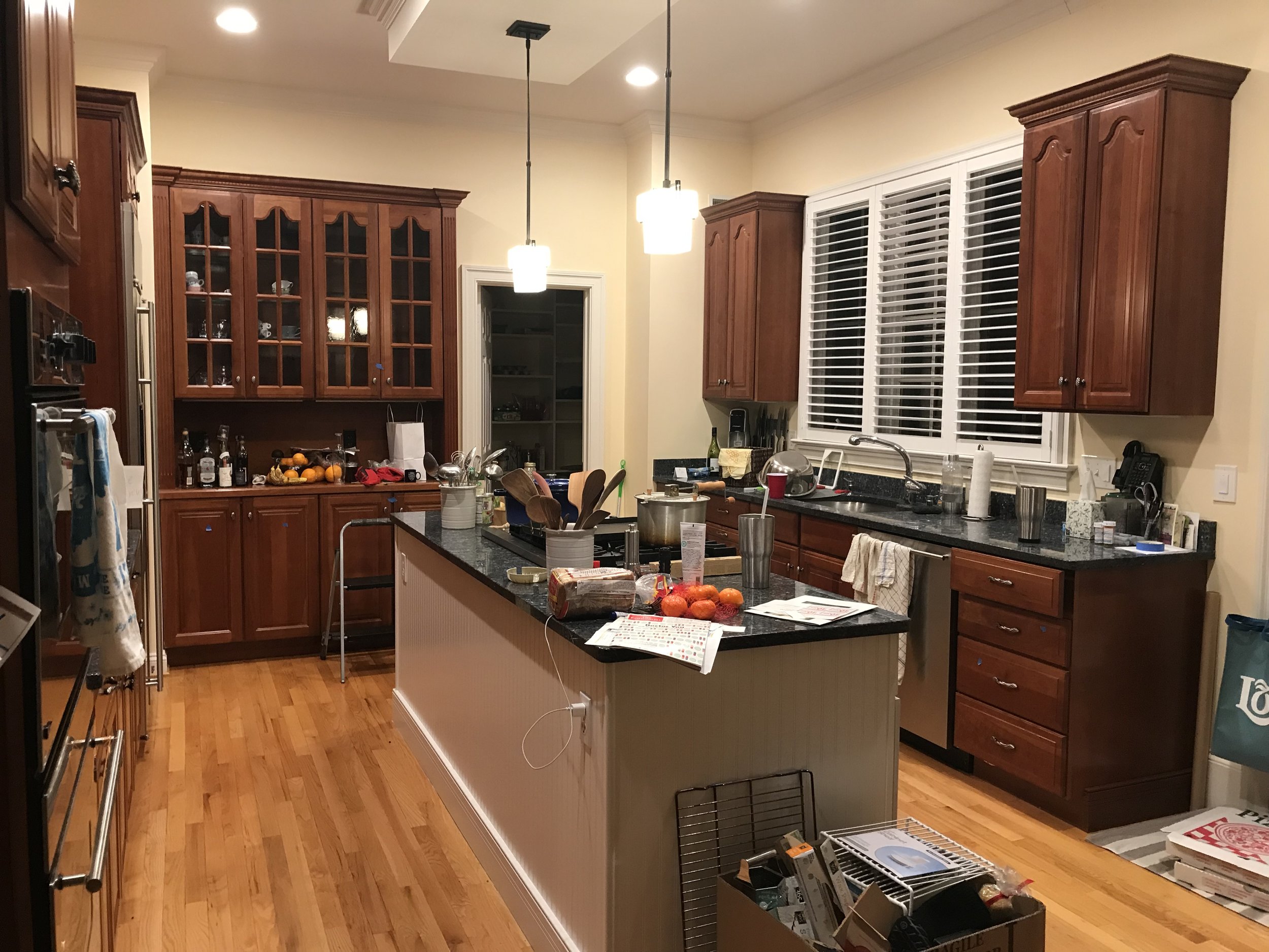
Our kitchen renovation: before and (almost completely) after

Yesterday, Em-i-lis turned 7. I had no idea until I received a Facebook notification from my 5th anniversary two years ago. How exciting! Since Em-i-lis was originally more food blog than anything, it seems fitting that today's post is all about our recent kitchen renovation. We're not completely done but we're close- just the window treatments and art and a few other minor details remain. It's been a slog but I'm starting to see how worth it it was.

When we moved into our home two years ago, much of it had been renovated since it was built in 2001. Yet the original kitchen remained and although it was not our style, it was functional, and so we were afforded the luxury of time to live and cook here, assess our kitchen-related needs as a family, and save.

Last year, the freezer started to only consider properly freezing things. Ice cream was always soupy, bread was always freezer-burned.

The hood behind our counter-installed range top broke such that when you pressed the button to send it back into hiding, it stuck halfway and jumped up and down like a sadly dying motor in purgatory. You had to manually force it down which was good for laughs and eye-rolls but loud, irritating, and highlighted the sense of urgency we’d started to feel about renovating.

The island on which the range top sat was not sized well to the kitchen. This resulted in lots of dead counter space flanking the range and also to annoying traffic jams on either long side of the island as someone needed to get into the cabinet under the microwave someone else was using or pass in a space two people couldn’t comfortable pass. It was a good object for the boys to run around but was otherwise not optimal.

The cabinets had starting showing their age. Knobs no longer aligned, panels were shifting oddly. Stylistically, too, everything started to feel uncomfortably dissonant.

And so it came to pass that with some concern about the stock market, wouldn’t it be a nice time to invest in our home instead. Tom suggested this last fall and I said “Heck, yes!”

We started researching appliances and considering ways we could improve the kitchen's functionality without moving walls. We knew we wanted better lighting, better air flow, an actual hood over a larger range, a single bowl sink, a larger freezer, and to keep two ovens. Although we made some progress, the space was large enough yet particular enough that we decided it would be smart to hire a designer. 

Tom and I are not designery folks. We love style and design (well, I really love it but Tom does have a good albeit somewhat austere and risk-averse eye) and have always been able to make good compromises that leave us both satisfied on our own. We are casual and don't love over-stylized stuff, but we wanted to do this right and knew it would cost a pretty penny to do that. So it made a lot of sense to work with someone who could help birth our vision intelligently.

From what we heard, many designers get caught up in their egos, their visions. We wanted to be hands on and ultimately enjoy a kitchen that felt like us. Comfortable, professional, uber-functional, pretty, and like home. We were lucky to cross paths with Sarah Carey, a local designer who is very talented, very intuitive, and objective in terms of not letting her personal preferences intrude on ours. Tom and I felt very involved, sourcing a number of the items we ended up using, Sarah's guiding principles and advice were enormous helps.

Sarah and I had already met actually, as she'd taken two of my cooking classes and asked me to teach for her dinner club. It was at her home that I discovered and first used a Lacanche range, a French work of art and serious piece of machinery. The Lacanche factory has been in the eponymous village in Burgundy since the 18th century. Originally an iron foundry, Lacanche evolved by 1796 to make stoves for the professionals and large estates.

Lacanche ranges have no display screens, no timers, nothing that beeps. They are simple yet sophisticated and powerful pieces of equipment for cooks who really want to enjoy the process and are willing to spend some time learning the personality of their range. They are utterly beautiful and can be personalized in many ways: enamel color, trim metals, traditional or modern style, burner size and layout. The complete lack of digital stuff was totally appealing to us as both Tom and I are sick of "smart" products that actually just make life more complicated and then break.

The Lacanche is a definite investment but we decided that the incredible quality was worth it and because only in the Sully style could we get two full ovens in a smaller than 60" range. American ranges are 48" or 60": with the former you get just an oven and a half while the latter just felt enormous. The Sully is 55" and is so beautifully proportioned. European ovens are smaller than American ones but are generally more efficient because of that and the Sully's "large" ovens fit my half-sheet pans with room to spare so I felt confident. 

We ordered six or eight enamel samples and after some hemming and hawing, went with our guts and Sarah's reading of my Pinterest "tea leaves" which screamed "Emily loves high contrast" and chose Ardoise, a rich charcoal gray, with traditional styling and brass and stainless trim. It is an absolute dream to cook on! Truly, I adore it so, so much.

ardoise.jpg
IMG_1558.jpg
IMG_2076.jpg

The range needs a 60" hood and we did not want that hanging into the middle of the kitchen. Tom drew up plans for a C-shape kitchen, removing that pesky island and turning the kitchen into a square of sorts. Sarah was thinking that too, and suggested moving the range to the spot once occupied in part by the fridge/freezer and in part by cabinets and microwave, moving the fridge/freezer to where the glass-front cabinets once stood, and finishing the C-shape with a very wide peninsula. We decided on a Vent-A-Hood because it is powerful and its patented Magic Lung results in a relatively quiet sone level.

Because we already have a marble breakfast table and were now committed to a large gray range, Sarah said it would be visual mayhem if we also used the quartzite sample I'd fallen in love with for the countertops. She was right. Concurrently, Tom and I decided that we wanted the most durable, kid- and acid-proof countertop possible. But one that was beautiful and not granite as we just needed a break from granite. All of these limitations helpfully narrowed our options, and we chose a quartz by Silestone, the Eternal Statuario. I didn't want it shiny so opted for the sueded finish, which is like honed or leathered. It's smooth and flat in terms of reflection and the finish minimizes the veining, making it more subtle.

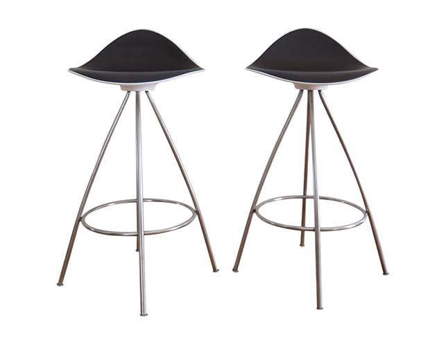
Also, because we could accommodate a quite wide peninsula which would be my primary prep area, we could bring back bar stools, an element I've really missed in this kitchen. 

IMG_1743.jpg
two of these are on the way

two of these are on the way

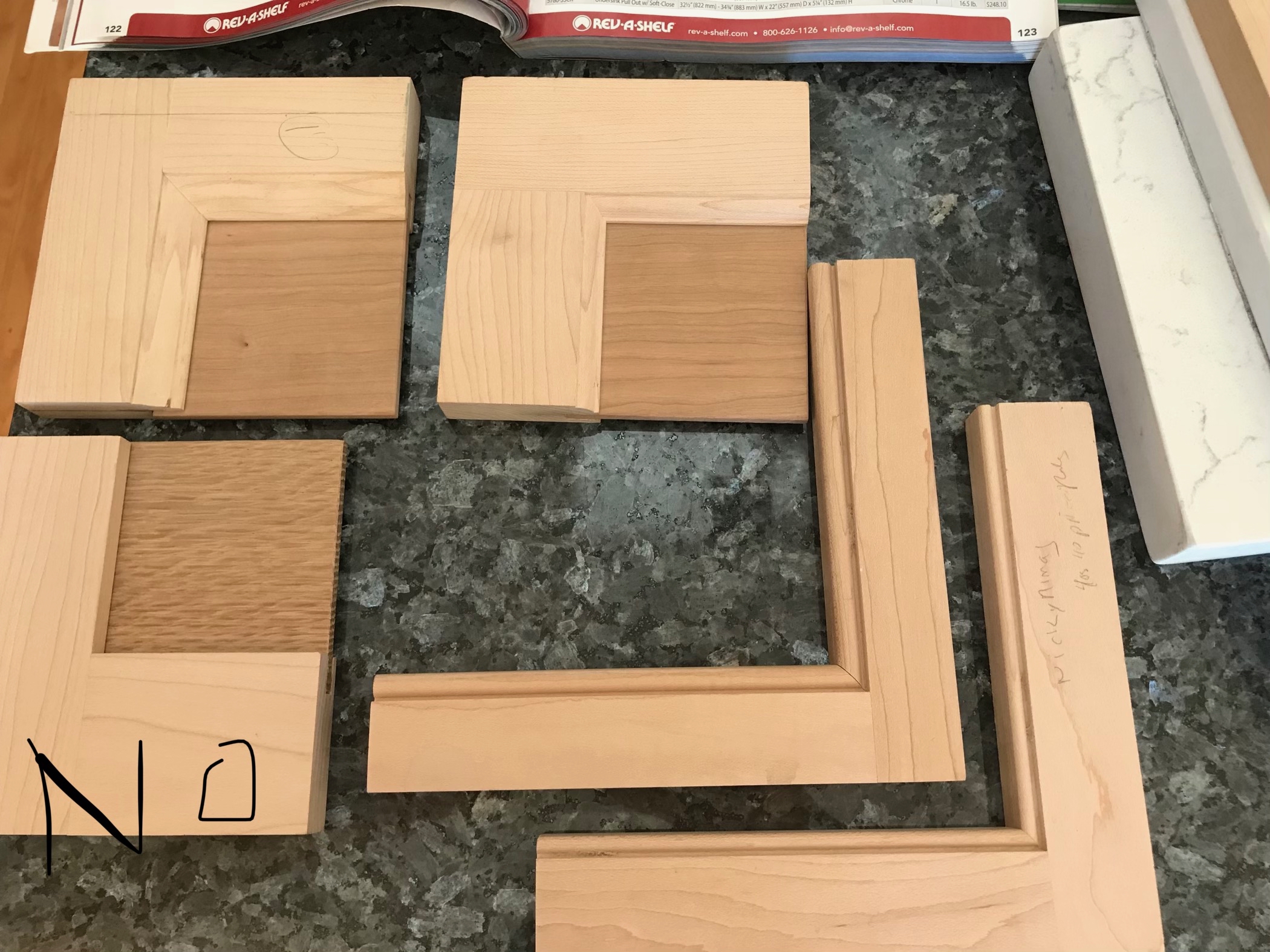
We decided to stick with white cabinetry with a simple bead for the same reason as choosing a minimalist counter and to panel our appliances so there weren't large chunks of stainless breaking up the sight lines. For visual variety though, Sarah suggested using glass fronts on the uppermost cabinets and also integrating a display area as we loved art and photography. I'm particularly pleased with that area!

various cabinet door styles

various cabinet door styles

I was originally overwhelmed by the prospect of choosing the white for the cabinets. Have you ever looked at the whites section at a paint store? Enormous. Have you ever tested whites? It could be a form of torture. Finally, we picked four or five commonly used kitchen whites, and our cabinet maker made samples. They all looked the same so we chose Decorator's White as it is crisp and clean with a gray undertone versus cream. 

Personally, I am tired of subway tile and so wanted something different for our backsplash. I love clean lines and have never met a herringbone I didn't love. Tom can't abide by chevrons but if you lay your herringbone horizontally, voila; no chevron-like waves. Again, I wanted a flat finish so we opted for a honed Carrara 1x2" herringbone, and, later, a platinum grout.

Our old sink was a dreadful unequally divided bowl contraption with the garbage disposal attached to the small side. I literally hated everything about it. It was too small for my big pots, and too shallow to accommodate a strong faucet stream without splashing. While fireclay farm sinks are gorgeous, I was worried about possible chipping as I cook with a lot of cast iron. Also, kids. So we decided on a professional grade 30” single bowl stainless undermount from Franke. I love it.

Screen Shot 2018-04-01 at 6.09.46 PM.png

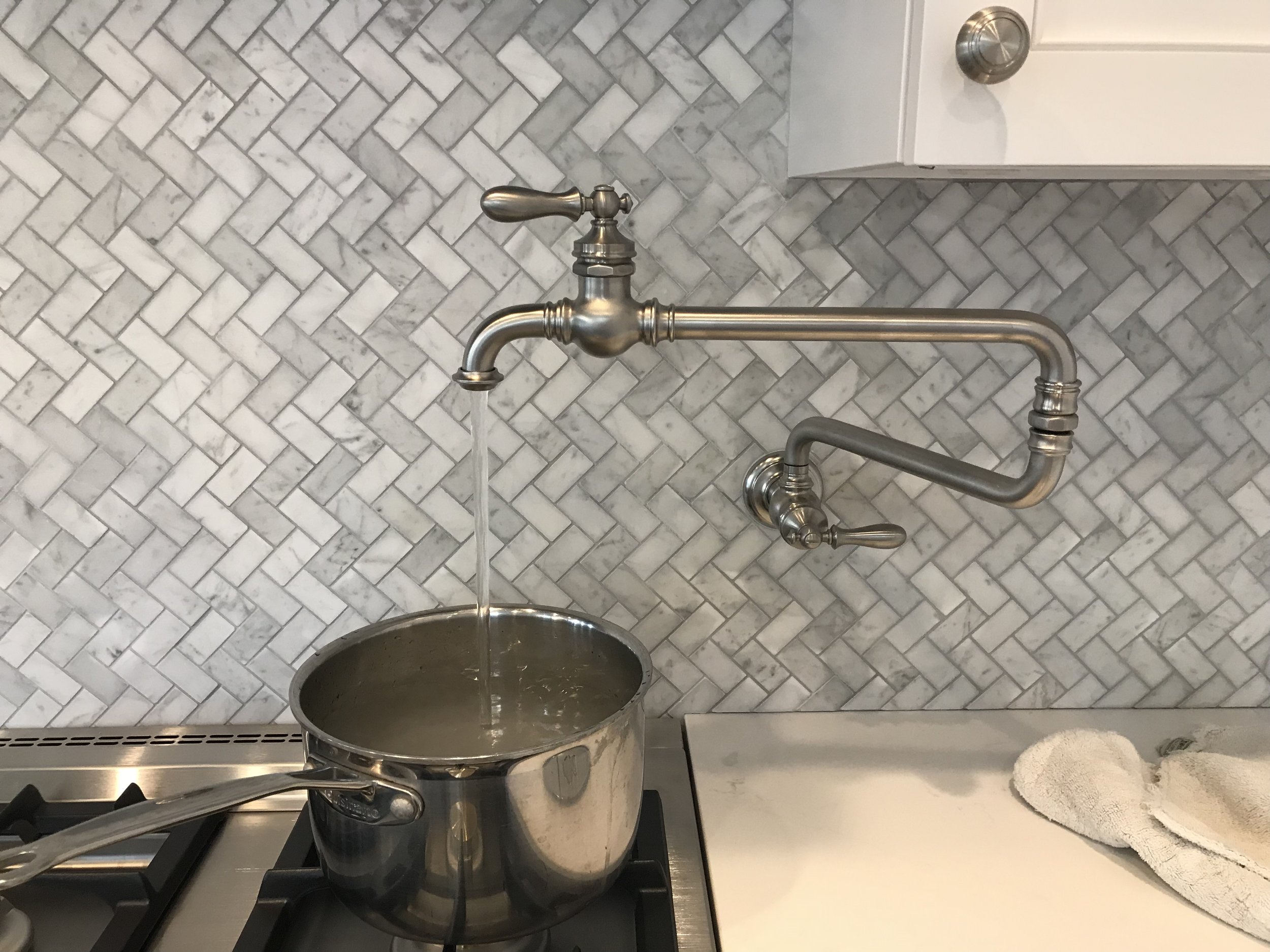
The sink and the range would now be across the kitchen from one another. Long-term (for aging parents, aging us) and even now for large pots, I worried about that distance. We gave much consideration to a prep sink in the peninsula or near the Lacanche but didn't want to lose the counter or drawer space that would require. Most pot fillers I've used in the past have been shoddily installed and so leak, break the backsplash tile, or hang at obviously incorrect angles. As such, I had bad feelings about them and was unwilling to consider one. However, Sarah assured me that buying a good one and ensuring it was well-installed would obviate those concerns, so we took the plunge.

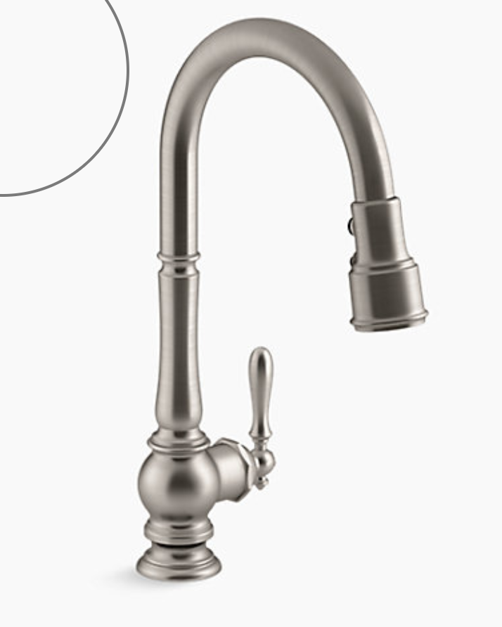
This decision led to another helpful limitation as not every faucet has a matching pot filler, and we wanted them to go together. The Kohler Artifacts series solved that challenge beautifully and provided us not only our faucet and pot filler but also our dish soap dispenser. We chose the vibrant stainless finish which is really lovely, satiny, understated, and clean. Also, it wasn't hard to find a matching garbage disposal air switch. Woot!

For a garbage disposal, we wanted powerful and so chose the 1 horsepower InSinkErator. Our old microwave (17 years old) still works perfectly, and I have many reservations about microwave drawers, so we decided to just stick with what we had and relocate it to a dedicated shelf in the pantry with its own circuit.

While we fell in love with and tried to plan around Gaggenau's column refrigerator and freezer, we ultimately chose the Sub Zero 48" side-by-side built-in unit. It's lovely, but I do wish its door shelves could hold gallons of milk and that you could easily get a handful of ice directly from the freezer.

I didn't care much about the dishwasher except that it had adjustable shelves and configurations and was not stupidly designed. I put Tom in charge and we went with a Bosch Benchmark. I'm still learning how to adjust everything but it cleans magnificently.

One of my favorite things is our new trash system. In the county we live in, you cannot commingle paper and all other recyclables so we need and use three bins: trash, paper, glass/aluminum/plastic. Plus we compost, and Tom was sick to death of our countertop bin. Sarah found a fantastic bin set made by Hafele (love the European sensibility on so many things) which includes two 40-quart bins, a 12-quart bin, and one 2.6-quart bin. We use the larger ones for trash and paper, the middle one for compost, and the smallest one for a roll of garbage bags. Recycling remains in the pantry which works well. 

the Hailo Euro Cargo waste system by Hafele

the Hailo Euro Cargo waste system by Hafele

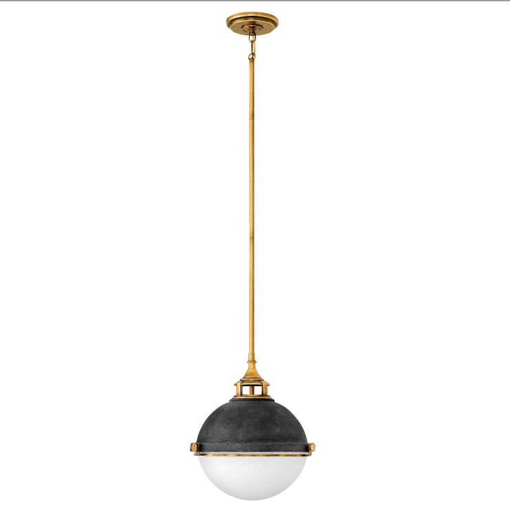
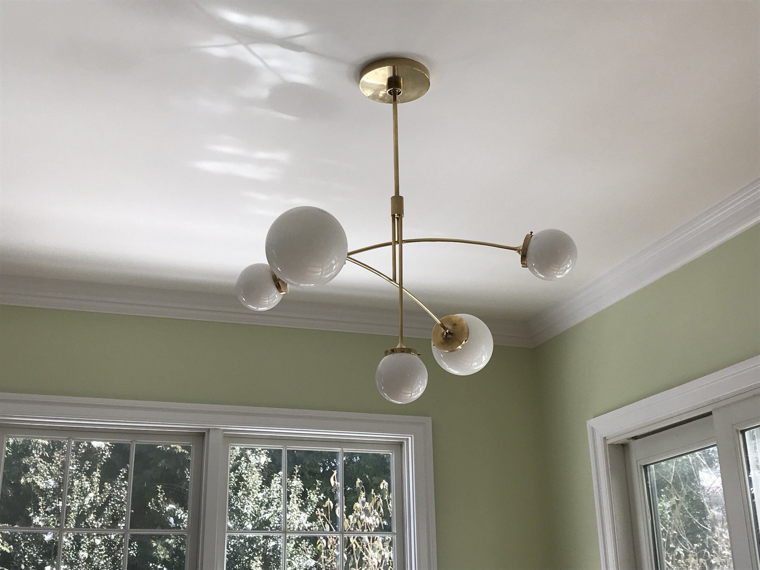
Lighting and paint were the last big decisions, and the former was infinitely simpler than the latter. During my planning, I'd pinned a pendant, the Fletcher, from Hinkley, and also the medium-sized Prescott chandelier by Kate Spade, and these are what we did use. I love them! We also updated the number and placement of our recessed lights and installed new under-cabinet lighting, all LED.

Paint was an expensive challenge. I think I tested nearly 30 samples. Gray is beautiful but gray kitchens are everywhere. Gorgeous, but I hoped for something a bit different and that brought the outdoors in. Y'all know how I love my yard. After trying a slate of grays and greens, T and I compromised and chose Green Ground, a beautiful verdant hue from Farrow & Ball. Because we did love Benjamin Moore's Coventry Gray, we used that in the pantry. 

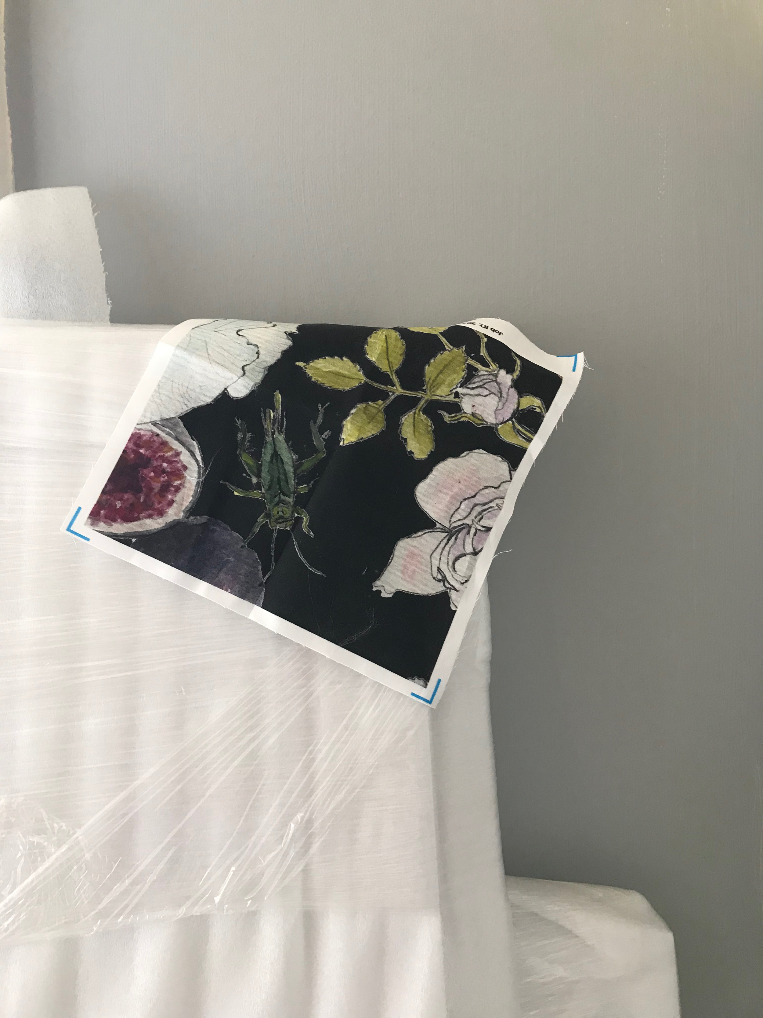
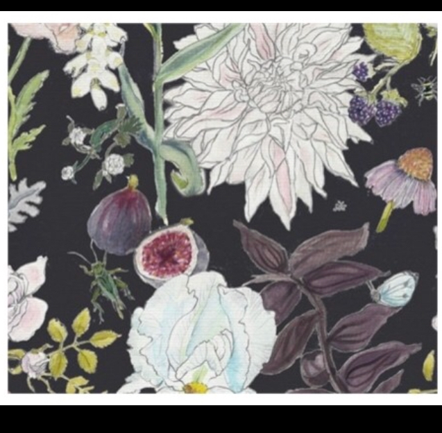
Above the three windows over our sink will hang a large Roman shade in this fabric which delights me endlessly.

And soon, the other windows will have shades crafted from a lovely Hartmann & Forbes woven product. We also decided to refinish the floors in a darker hue as they weren't in great shape, and the golden natural color wasn't really us (and took the opportunity to use the commercial finish because, again, kids). This has made an enormous, beautiful difference in the house. Oh, and our knobs and pulls are the Art Deco and Somerville, respectively, from Rejuvenation.

We are still organizing and learning to navigate a new space and new appliances, but so far, we are beyond thrilled. What an absolute dream of a kitchen and it makes our home that much more ours. In gratitude, Emily

IMG_2174.jpg
IMG_2175.jpg
IMG_2181.jpg
IMG_2177.jpg
IMG_2176.jpg